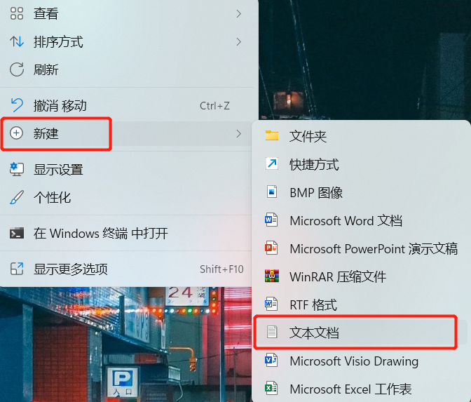
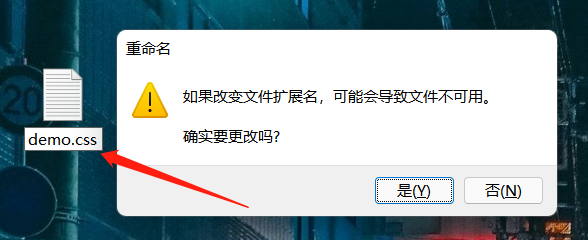
七夕❤️朋友圈—炸锅了

大事件

今早起来,逛逛朋友圈,看到的全是各种秀。唉,图片咱就不放了,难免戳中某位朋友瘦小的心灵,主要我也怕,你们知道叭

这种时候怎么能让我们的朋友圈是白茫茫的一片呢?必须怼回去,这气可不能受,下面的操作学会了,这波气势也不输,还不快快学起来~~

文件建立

桌面右击,新建文本文档

将文件命名格式修改为 .css ,保存, js 文件建立同理

3D立体相册

demo.css

1
2
3
4
5
6
7
8
9
10
11
12
13
14
15
16
17
18
19
20
21
22
23
24
25
26
27
28
29
30
31
32
33
34
35
36
37
38
39
40
41
42
43
44
45
46
47
48
49
50
51
52
53
54
55
56
57
58
59
60
61
62
63
64
65
66
67
68
69
70
71
72
73
74
75
76
77
78
79
80
81
82
83
84
85
86
87
88
89
90
91
92
93
94
95
96
97
98
99
100
101
102
103
104
105
106
107
108
109
110
111
112
113
114
115
116
117
118
119
120
121
122
123
124
125
126
127
128
129
130
131
132
133
134
html {
background: #000;
height: 100%;
}

.wrap {
position: relative;
position: absolute;
top: 0;
right: 0;
bottom: 0;
left: 0;
width: 200px;
height: 200px;
margin: auto;
}

.cube {
width: 200px;
height: 200px;
margin: 0 auto;
transform-style: preserve-3d;
transform: rotateX(-30deg) rotateY(-80deg);
-webkit-animation: rotate 20s infinite;
animation-timing-function: linear;
}

@-webkit-keyframes rotate {
from {
transform: rotateX(0deg) rotateY(0deg);
}
to {
transform: rotateX(360deg) rotateY(360deg);
}
}

.cube div {
position: absolute;
width: 200px;
height: 200px;
opacity: 0.8;
transition: all .4s;
}

.pic {
width: 200px;
height: 200px;
}

.cube .out_front {
transform: rotateY(0deg) translateZ(100px);
}

.cube .out_back {
transform: translateZ(-100px) rotateY(180deg);
}

.cube .out_left {
transform: rotateY(90deg) translateZ(100px);
}

.cube .out_right {
transform: rotateY(-90deg) translateZ(100px);
}

.cube .out_top {
transform: rotateX(90deg) translateZ(100px);
}

.cube .out_bottom {
transform: rotateX(-90deg) translateZ(100px);
}

.cube span {
display: bloack;
width: 100px;
height: 100px;
position: absolute;
top: 50px;
left: 50px;
}

.cube .in_pic {
width: 100px;
height: 100px;
}

.cube .in_front {
transform: rotateY(0deg) translateZ(50px);
}

.cube .in_back {
transform: translateZ(-50px) rotateY(180deg);
}

.cube .in_left {
transform: rotateY(90deg) translateZ(50px);
}

.cube .in_right {
transform: rotateY(-90deg) translateZ(50px);
}

.cube .in_top {
transform: rotateX(90deg) translateZ(50px);
}

.cube .in_bottom {
transform: rotateX(-90deg) translateZ(50px);
}

.cube:hover .out_front {
transform: rotateY(0deg) translateZ(200px);
}

.cube:hover .out_back {
transform: translateZ(-200px) rotateY(180deg);
}

.cube:hover .out_left {
transform: rotateY(90deg) translateZ(200px);
}

.cube:hover .out_right {
transform: rotateY(-90deg) translateZ(200px);
}

.cube:hover .out_top {
transform: rotateX(90deg) translateZ(200px);
}

.cube:hover .out_bottom {
transform: rotateX(-90deg) translateZ(200px);
}

效果展示

爱心表白

test.css

1
2
3
4
5
6
7
8
9
10
11
12
13
14
15
16
17
18
19
20
21
22
23
24
25
26
27
28
29
30
31
32
33
34
35
36
37
38
39
40
41
42
43
44
45
46
47
48
49
50
51
52
53
54
55
56
57
58
59
60
61
62
63
64
65
66
67
68
69
70
71
72
73
74
75
76
77
78
79
80
81
82
83
84
85
86
87
88
89
90
91
92
93
94
95
96
97
98
99
100
101
102
103
104
105
106
107
108
109
110
111
112
113
114
115
116
117
118
119
120
121
122
123
124
125
126
127
128
129
130
131
132
133
134
135
136
137
138
139
140
141
142
143
144
145
146
147
148
149
150
151
152
153
154
155
156
157
158
159
160
161
162
163
164
165
166
167
168
* {
margin: 0;
padding: 0;
border: 0;
}

.icon-love {
width: 400px;
}

html,
body {
width: 100%;
height: 100%;
}

body {
overflow: hidden;
}

.container {
width: 100%;
height: 100%;
position: relative;
}

.body_left {
width: 300px;
height: 300px;
left: 0;
bottom: 110px;
position: absolute;
z-index: 98;
}

.container .love {
width: 520px;
height: 440px;
left: 50%;
top: 50%;
position: absolute;
margin: -260px 0 0 -220px;
}

.love .block {
right: 0;
position: absolute;
visibility: hidden;
background-color: yellow;
}

.love .block div {
width: 40px;
height: 40px;
position: absolute;
background: url("../image/love.jpg") no-repeat;
background-size: contain;
box-sizing: border-box;
}

@keyframes border {
0% {
width: 0;
}
5% {
width: 5%;
}
10% {
width: 10%;
}
15% {
width: 15%;
}
20% {
width: 20%;
}
25% {
width: 25%;
}
30% {
width: 30%;
}
35% {
width: 35%;
}
40% {
width: 40%;
}
45% {
width: 45%;
}
50% {
width: 50%;
}
55% {
width: 55%;
}
60% {
width: 60%;
}
65% {
width: 65%;
}
70% {
width: 70%;
}
75% {
width: 75%;
}
80% {
width: 80%;
}
85% {
width: 85%;
}
90% {
width: 90%;
}
95% {
width: 95%;
}
100% {
width: 100%;
}
}

.footer {
bottom: 30px;
position: relative;
z-index: 99;
}

.footer .border .border-top {
border-top: 3px solid black;
transform-origin: left center;
-webkit-animation: border 312 linear;
-o-animation: border 12s linear;
animation: border 12s linear;
animation-fill-mode: both;
}

.footer .border .border-bottom {
float: right;
border-top: 3px solid red;
transform-origin: right center;
-webkit-animation: border 7s linear 12s;
-o-animation: border 7s linear 12s;
animation: border 7s linear 12s;
animation-fill-mode: both;
}

.footer .copyright {
width: 100%;
height: 30px;
position: absolute;
bottom: -30px;
text-align: center;
}

.copyright div {
width: 30%;
line-height: 30px;
display: inline-block;
}

.copyright div span {
color: dimgray;
}

Mylove.js

1
2
3
4
5
6
7
8
9
10
11
12
13
14
15
16
17
18
19
20
21
22
23
24
25
26
27
28
29
30
31
32
33
34
35
36
37
38
39
40
41
42
43
44
45
46
47
48
49
50
51
52
53
54
55
56
57
58
59
60
61
62
63
64
65
66
67
68
69
70
71
72
73
74
75
76
77
78
79
80
81
82
83
84
85
86
87
88
89
90
91
92
93
94
95
96
97
98
99
100
101
102
103
104
105
106
107
108
109
110
111
112
113
114
115
116
117
118
119
120
121
122
123
124
125
126
127
128
129
130
131
132
const blk_pitn = {
block1: [[0, 1], [0, 0], [-1, 0], [-1, -1]],
block2: [[0, 1], [0, 0], [-1, 0], [0, -1]],
block3: [[-1, 1], [0, 0], [-1, 0], [-1, -1]],
block4: [[0, 1], [0, 0], [-1, 0], [-1, -1]],
block5: [[-1, 1], [0, 0], [-1, 0], [0, -1]],
block6: [[0, -1], [0, 0], [-1, 0], [1, -1]],
block7: [[-1, -1], [0, 0], [-1, 0], [1, 0]],
block8: [[-1, 1], [0, 0], [-1, 0], [-1, -1]],
block9: [[0, -1], [0, 0], [-1, 0], [1, 0]],
block10: [[-1, 1], [0, 0], [-1, 0], [1, 0]],
block11: [[2, 0], [0, 0], [-1, 0], [1, 0]],
block12: [[0, 1], [0, 0], [-1, 0], [0, -1]],
block13: [[0, 1], [0, 0], [-1, 0], [-1, -1]],
block14: [[1, 1], [0, 0], [-1, 0], [1, 0]],
block15: [[1, -1], [0, 0], [-1, 0], [1, 0]],
block16: [[-1, -1], [0, 0], [-1, 0], [1, 0]],
block17: [[0, 1], [0, 0], [-1, 0], [0, -1]],
block18: [[0, 1], [0, 0], [-1, 0], [-1, -1]],
block19: [[0, -1], [0, 0], [-1, 0], [1, 0]],
block20: [[1, -1], [0, 0], [-1, 0], [1, 0]],
block21: [[0, 1], [0, 0], [-1, 0], [-1, -1]],
block22: [[1, 1], [0, 0], [-1, 0], [1, 0]],
block23: [[0, 2], [0, 0], [0, -1], [0, 1]]
},
offset_pitn = {
block1: [5, 3],
block2: [5, 1],
block3: [3, 4],
block4: [3, 2],
block5: [3, -1],
block6: [2, 5],
block7: [2, 1],
block8: [1, -1],
block9: [1, -3],
block10: [1, 2],
block11: [0, 3],
block12: [0, 0],
block13: [-1, -4],
block14: [0, -2],
block15: [-2, 4],
block16: [-2, 2],
block17: [-2, 0],
block18: [-3, -2],
block19: [-4, 0],
block20: [-3, 5],
block21: [-5, 3],
block22: [-4, 1],
block23: [-6, 1]
};

let blocks = document.getElementsByClassName("block"),
block = blocks[0],
love = document.getElementsByClassName("love")[0],
timer = null,
index = 0,
clone_block;


block.style.top = "50%";
block.style.left = "50%";
block.style.margin = "-20px 0 0 -20px";

const block_left = parseFloat(window.getComputedStyle(block, null).left.slice(0, -2)),
block_top = parseFloat(window.getComputedStyle(block, null).top.slice(0, -2));

function Next() {
if (++index >= 24) {
clearInterval(timer);

Rise();
return;
}

block.style.visibility = "visible";


block.style.left = block_left + 40 * offset_pitn["block" + index][0] + "px";
block.style.top = block_top - 40 * offset_pitn["block" + index][1] + "px";
for (let i = 0; i < block.children.length; i++) {
block.children[i].style.left = blk_pitn["block" + index][i][0] * -40 + "px";
block.children[i].style.top = blk_pitn["block" + index][i][1] * -40 + "px";
}

clone_block = block.cloneNode(true);
love.appendChild(clone_block);

if (love.children.length >= 24) {
blocks[blocks.length - 1].children[2].style.display = "none";
block.style.display = "none";
}
}

function Rise() {

console.log("begin");
let timer2 = null,
distance = 0;

const target = 120,
speed = 1;


let love_top = parseFloat(window.getComputedStyle(love, null).top.slice(0, -2));


timer2 = setInterval(() => {
distance += speed;
if (distance >= target) {
clearInterval(timer2);

console.log("over");

}

love.style.top = (love_top - distance) + "px";

}, 22);

}

window.onload = function () {
setTimeout(() => {

timer = setInterval(() => {
Next();
}, 300);


}, 12000);
};

效果展示


xdm,师弟只能带你到这里了,剩下的修行就靠你们自己了,我先行一步,暂且告退……